A budget-first meal planner for students, designed for the night the plan falls apart.
Students overbuy, food spoils before they know what to cook, and most of it gets thrown out. Budget, fridge and recipe apps each fix only one step.
Plan from the fridge, not from zero: 3 shared-ingredient meals, a budget cap, inventory-first suggestions and takeout built into the week.
An end-to-end prototype with Sunday planning, a priced grocery list and a way out on tired nights. Peer-reviewed at 4.89/5.
I kept throwing my groceries away
this one started with my own fridge.
Every grocery run went the same way, and each step made the next one worse. Then the next run started from zero again.
of surplus food is perishable, like produce and dairy, the stuff that spoils in the fridge
ReFED ↗Four apps for one problem
Budget trackers, fridge inventories, recipe finders and meal planners each fix one step of that loop. None of them see the whole loop, so the waste happens in the gaps between them. I wanted one planner that connects all four.
Buy what you’ll actually cook, and use up what you have.
A plan that bends when the week doesn’t go to plan.
Added after peer feedback: dietary restrictions and targets like a weekly calorie limit, on top of the budget cap.
Mealime vs. Pivot
Mealime has a huge recipe library, and that’s part of the problem. Every plan means scrolling and deciding again, and it doesn’t know what’s already in your fridge, so each check-in starts from scratch. Pivot takes decisions off your plate by planning from what you already own.
Plan from the fridge, not from zero
Every step of that loop has the same root: each plan starts from scratch and assumes a perfect week. So Pivot starts from what you already have, and expects some nights to go off-plan. Each principle breaks one step of the loop.
Meals, not 7
Fewer recipes that share ingredients, so you buy less.
Breaks: ShopBudget first
Caps on groceries and eating out, set before you shop.
Breaks: ShopFridge first
Suggestions start from your inventory, not a recipe library.
Breaks: Store · Cook?A way out
Planned takeout, a rescue meal or Blind Box when plans slip.
Breaks: TossReFED’s advice to households points the same way: plan ahead, cook “recipe trios” that share ingredients, and plan for takeout nights. ReFED ↗
Pick 3 → Shop → See the week → Cook
Pick 3 on Sunday
Instead of filling seven slots, you drag in three meals. Pivot only offers recipes that share ingredients, so the basket stays under your weekly budget.
One smart shop
Three recipes become one priced list. Pivot shows its work as it builds the list, so you can trust the result:
- Reads your 3 recipes
- Merges shared ingredients
- Skips what’s already in your fridge
- Prices the basket
A week with a night off
Takeout night is a planned slot in the week, so ordering food is part of the plan, not a broken streak. Meals that need cooking go around it.
Cook today
The Today view shows one next meal and your progress (“Meal 1 of 3”). The Pivot slider trades budget against nutrition, so you can swap in a higher-protein version and see what it costs.
When Wednesday happens
This is where the product gets its name. When you’re too tired to cook the plan, you get two ways out that still use what you already bought.
Cook from what’s in stock
Shows what’s ready to cook now and which recipes are one or two items away.
Pick a vibe, Pivot decides
For nights when even choosing feels like too much. Tap 2–3 vibes and Pivot picks the meal.
What I changed, and why
Close the modal and return home
Land on the cart, so users see the result right away
The first flow worked, but after the modal closed nothing on screen showed that a list had been made. Landing on the cart makes the result visible. This is where “logic isn’t experience” came from.
A rule that enforces the budget
A flexible starting point, not a rule
A hard limit would bring back the guilt Pivot is meant to remove. Three meals is now the default, and you can change it.
Less typing, fewer surprises
These support the core loop. Each one removes a step that would otherwise make students give up on planning.
Who are you?
Pick a profile, a budget and your kitchen setup, so the first plan already fits.
One priced list
Grouped by aisle, with each item linked to the meals it’s used in.
Load the fridge
Scan a receipt to fill your fridge. Pivot flags what expires soon.
Designing with an AI pipeline
AI widened the options. I chose what got through each step.
Pivot was Project 2 in The AI Augmented Designer at CMU HCII. The brief was to design a competitor to an existing product in 3 weeks, using AI across Discover, Define, Develop and Deliver. The real assignment was metacognition: noticing where AI helped my thinking and where it didn’t.
Pick an incumbent and find a need it doesn’t serve. I picked Mealime.
Develop my own design style and a more advanced prototyping process.
Plan, monitor and evaluate how I used AI at each step.
I chained AI generators so each one’s output fed the next. I set the priorities going in and reviewed every output.
-
Discover
Deep research
As a UX research lead, searched Reddit and meal-app reviews for students’ complaints
Synthetic usersPersonas built from that research, not from a generic role-play prompt
Research summaryThemes and personas
-
Define
Need statement generator
User · Need · Goal · Measurement
Need statementRequirement generatorWhat it achieves for the user · what it must do · constraints · priority
Built with me, from the research summary and my prioritiesPrioritized requirements & constraints -
Develop
Feature ideator
Functions · Screens · Databases · User flows
Feature listSpec writerFunctional and technical specs
Specifications -
Deliver
Prototype in Figma Make
60+ versions
AI as critiquerCritiqued each version: what’s working, what isn’t
Peer review3 classmates, 4.89/5
Research first, personas second
A naive prompt (“You are a 21-year-old student…”) gives you a made-up character. Instead, I had the AI do the research first, then build personas from what it found, so they carried real student complaints.
“You are a professional UX research lead. Search Reddit, app-store reviews of Mealime and other meal planners, and student forums for complaints students have about planning meals on a budget. Based on your research, create a set of personas we can use to design a better meal planner.”
Pattern paraphrased from the method I used, not the exact prompt.
3 classmates tried it
Three classmates tried the prototype and scored it on a 6-part design rubric (1–5), then wrote what worked and what they’d change. It’s a small sample, but they all asked for the same missing piece.
Average across all 6 criteria
Interaction: well reasoned and well designed, from all 3 reviewers
Rated the goal as well reasoned (5/5)
“The system reduces cognitive load by making decisions when users are overwhelmed.”
Reviewer 1
“All of the user flows were very clear and intuitive… the navigation across all of the app’s different pages was very smooth.”
Reviewer 3
“I can definitely see myself using this app.”
Reviewer 2
Auditing my own prototype
Peers rated the flows highly. Then I checked the recorded prototype against Nielsen’s 10 usability heuristics myself, rating each issue from 1 (cosmetic) to 4 (must fix). Four issues scored a 3. The most important one is shown before and after below.
The Pivot slider moves, but nothing changes
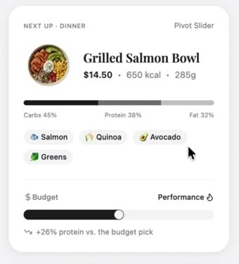
What already worked: the “Building your list” progress steps, the “Used in” thumbnails on every grocery item, missing-ingredient prices, back and close on every step, and a Generate button that stays disabled until 3 meals are picked.
Two lessons, one next step
Logic isn’t experience
A flow can be correct and still leave people unsure it worked. If people can’t see the result, the feature doesn’t feel like it worked.
Explore wide, then simplify
Generating ideas is cheap. Choosing what to cut is the design work.
Next: plans that know you
All three reviewers pointed to the same gap. Add dietary restrictions and fitness goals to onboarding, so budget, nutrition and the Wednesday rescue all work from one profile.